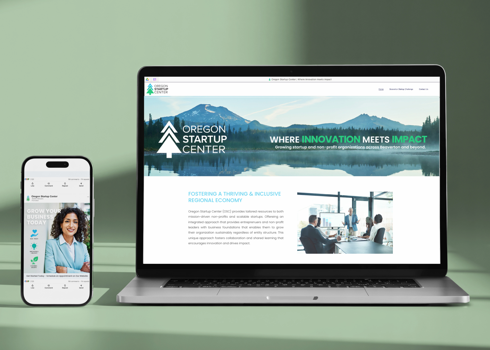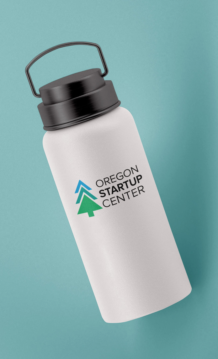
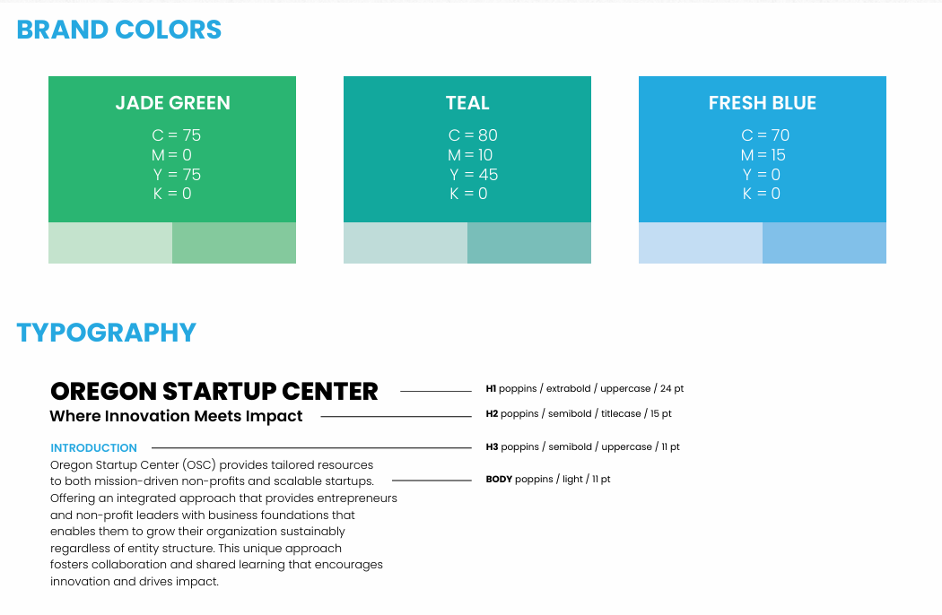
Challenge
The Oregon Startup Center needed a refreshed visual identity that better reflected its role in supporting and investing in nonprofits and small businesses across Oregon. The existing branding lacked a strong visual connection to growth, innovation, and the state itself.
Solution
To address these goals, I designed a clean combination mark featuring a custom icon paired with a structured typographic layout. The icon merges an upward-facing arrow with a pine tree, creating a triple meaning that communicates growth, optimism, and a direct connection to the state of Oregon. I stacked the word mark vertically to create a compact and versatile composition, while increasing the weight of “Startup” to reinforce the organization’s primary focus. The final identity balances professionalism and approachability while giving the OSC a modern visual system that clearly communicates its mission.