Challenge
Press Orchards required a packaging system for a premium organic juice brand that could communicate freshness, quality, and transparency while differentiating multiple flavors within a cohesive product line. The packaging needed to balance strong shelf presence with clear information hierarchy, ensuring that branding, flavor details, ingredients, nutrition information, and product storytelling remained both visually appealing and easy to navigate.
Solution
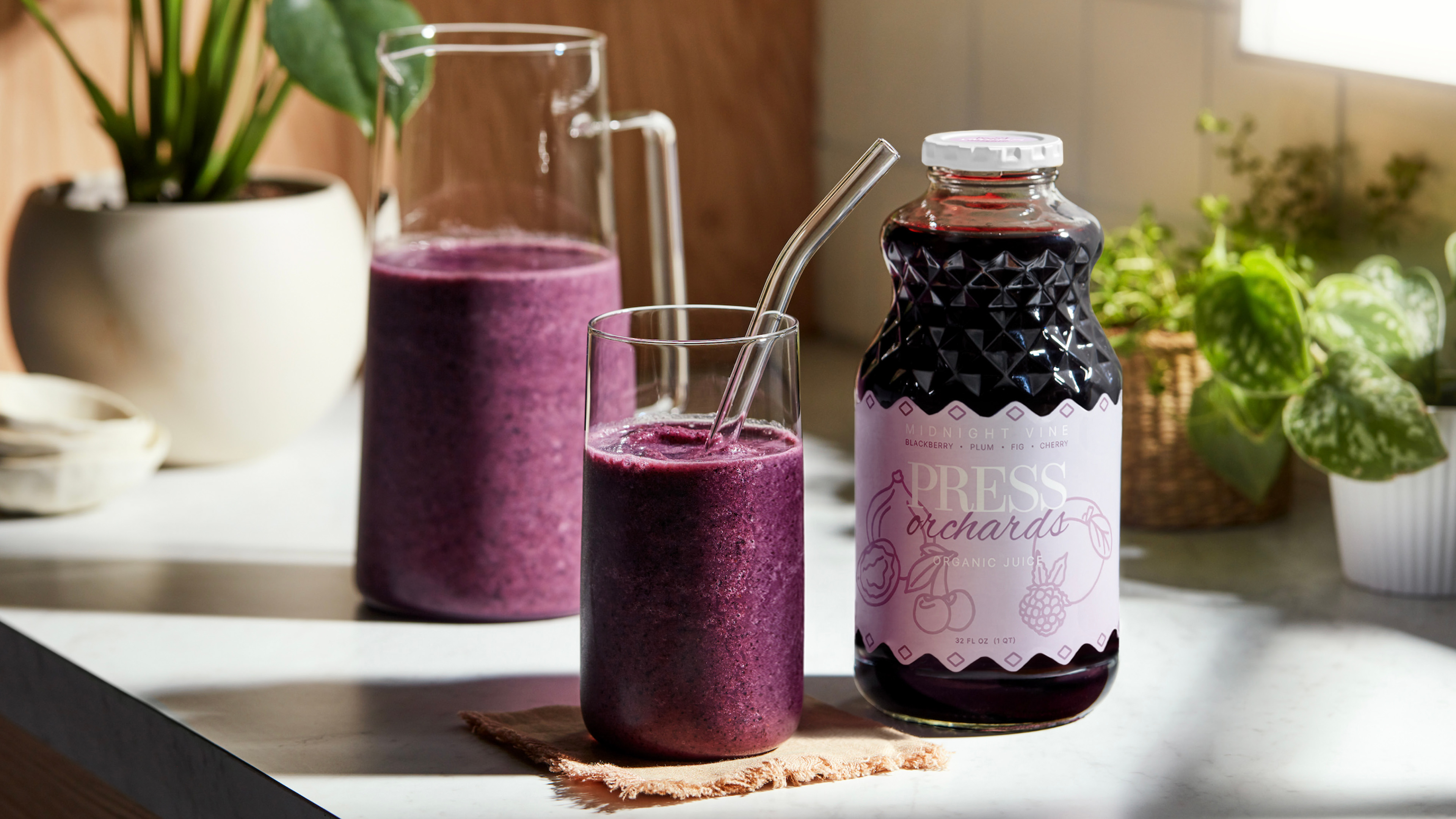
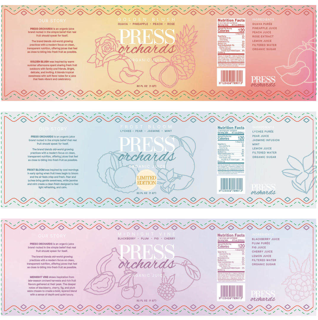
I developed a unified label system for three flavors: Golden Blush, Midnight Vine, and the limited-edition Frost Bloom, using monochromatic color palettes tailored to each flavor profile. The labels feature a subtle gradient background with custom line art that frames the typographic logo, creating a distinct visual identity while maintaining consistency across the collection.
Careful attention was given to typography, hierarchy, and layout to ensure that all key information remains clear and accessible, resulting in a packaging system that feels refined, inviting, and true to the brand’s commitment to simple, fruit-forward ingredients.